
Palettes of the Willamette Valley: How the colors you wear can turn your images in to art

One of the most stressful parts that most of my clients me prior to our work together, is styling their session. Common questions and statements and questions that I hear are:
“Where do we start?”
“Should we match?”
“What colors do we pick?”
“Where do we shop?”
“What looks good in the camera?”
“I don’t want to buy something I’ll never wear again”
“I don’t want to not feel like me”
“I don’t wan’t to dress fancy”
What I want to tell you, is that it doesn’t have to be stressful. I’m available to walk you through every step of styling your session. At my home in Eugene, Oregon, I have a client closet full of high end wardrobe for you to pick from. Whether we are adding final touches to your outfits, or starting from scratch.

Here are some related tips when it comes to styling and color:
- Texture: bringing various textures throughout your wardrobe adds depth and interest If each family member is wearing the same material, tone, or pattern, it won’t add a lot of interest to they eye. On the flip side, too much going on can be too busy. It’s about finding the sweet spot.
- Look at your home: Is your decor warm or cool? Notice the details in the way you decorate your home. These photos will be a part of the artwork on the walls, so it’s helpful to imagine them as a piece of artwork you are collaboratively creating.
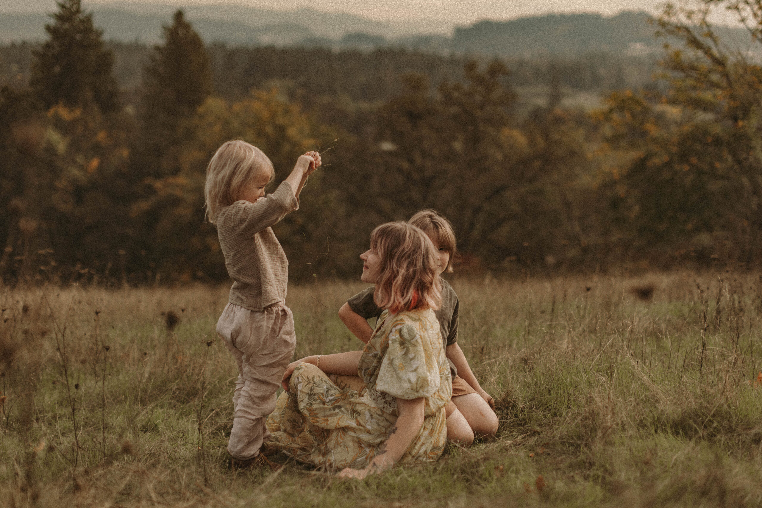
- Season: Oregon, and specifically the Eugene area, has 4 seasons (although we generally don’t have snow down in the Valley). Will your session be in the Fall (orange, rust, golds, greens), Winter (can be foggy/over cast with greens, browns, creams), Spring (greens, depending on location florals), or Summer (golds)?
- A Note on Greens: Eugene, and everywhere in the Willamette Valley is very green most of the year. Depending on the location, it’s best to be intentional with wearing lots of green, because it can reflect on your skin tones and look “muddy.” This is most noticeable in the Spring when the greens are lush and beautiful. It is generally not an issue on the Oregon Coast, and green looks beautiful there!

- Colors and styles differ per photographer: Before becoming a professional photographer, I did not know the difference from one to the next. There are just as many differences as there are between painters, singers, and any other kind of artist. Colors that work well for one photographer’s style of editing, may look terrible for another. They may also not work with the style of their work. Without sounding like this is an overly complicated process (I promise it isn’t!), find a photographer whose work you admire and want to hang on your walls, ask for feedback and direction, and make it a collaborative process. Remember that every photographer does things differently, so their advice and process may not be the same.
- Be inspired by the location: Pulling colors from the location pulls the whole image together. Rather than the clothes themselves being the center focus, the focus can be on you, and the emotion filling the camera. That isn’t a strict rule, but I’ve found that the images that I most love, don’t have flashy colors or dramatic dresses. They are the images that are artfully crafted and subtly styled. Oregon colors range from browns, rust, tans, creams, greens, mustard, grays, gray-blue – there are so many options.
- Neutralize the color: Bright colors don’t edit well – if you like yellow, pick mustard. If you like orange, pick rust. If you like baby blue, go for a grayish blue, etc. They will turn out beautiful, trust me
- Be you: You should never feel like this “isn’t you” – your photos should absolutely feel like you. If you like to be a little dressy sometimes, then great! If you don’t, also great! There are ways to craft a beautiful image, while still creating art, in casual and dressy clothing. Both are beautiful.
- Don’t forget the details – like shoes and accessories!
- Very important: **Always avoid logos and neons**

Below is some color palette inspiration:


Color palettes curtesy of Anna Kresik
Leave a Reply
follow us on


Be the first to comment